


 Posts
Posts


Showing posts with label Groupings. Show all posts
Showing posts with label Groupings. Show all posts
Wednesday, July 20, 2011

Here is a quick little before and after.
Just want you to see how simple it can be to fill a space
when using the right design principles.

BEFORE
The space above this buffet is quite tall and
needs something in the right scale to make it feel complete.

AFTER
See how this is a simple solution.
The mirror is large enough to balance out
the piece of furniture and is the right size for
the space on the wall.
By hanging it vertically it is taller as well as narrow enough
to come in about 6 inches on each side of the buffet.

When you look at the whole grouping,
the height of the mirror, the lamp and the glass bowl
are three different heights.
the height of the mirror, the lamp and the glass bowl
are three different heights.
This is a simple way to create a unit that works!

Here is a little more of the room...
I will show you the rest soon.
Thursday, May 26, 2011

A good grouping can include pieces of furniture
that are next to the items on the wall.
In this photo we hung two framed pieces with
one green wreath in the middle.
This added texture, something 3-dimensional and a
natural element all in one!
See how the framed art is hung vertical
and the bottom one feesl like it fits right
in with the chair.
When you add the lamp right next to the chair
it all fits together nicely.

In this BEFORE shot the grouping on the wall
is hung high above the couch.

This is the AFTER of the same wall.
See how we created a group with the artwork,
the lamp, and the couch.
(We brought up the leather sofa from the basement)

BEFORE
In this area there was too much in the group.

AFTER
Sometimes you have to take away items.
And when you do it feels so much better.
The wall cabinet with the lamps and the mirror
really work well as a group.

Doesn't this feel more like a space you want to be in?
And this was all done using items that this home owner
had in her home already!
Look around your house and see what you may be able
to group together.
Tuesday, May 4, 2010
Okay, Life is wonderful! . . . and I have not forgotten you all. Here is a little post for today ---

One example of how to group some framed photos.

The spacing between the frames is about the same width, with the FAMILY centered at the top.
Try a grouping at your house!
Thursday, January 14, 2010
 My last post was a quiz about this room. Today I have the answers!
What made the difference?
 BEFORE
The bed was the dominant piece in the room. The wall to the right really needed something to balance out some of the visual weight of the bed.

AFTER
A dresser seemed like the logical choice. But thier bed has drawers underneath so they did not have a dresser.
In the closet we found a cedar chest. We also took a shelf with a quilt rod from another room, and together created enough visual weight to balance out the heavy bed.


Notice how all of these items seem to have a common theme. This homeowner is drawn to a country cottage feel. So when we shopped the house we were able find items that fit together nicely.
You will see this in your own home --- you are usually drawn to a certain kind of style or look.

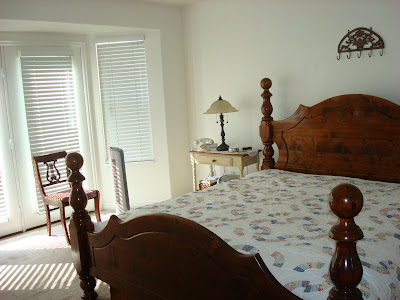 BEFORE
The bedroom was rather plain and showed very little personality.
 AFTER
AFTER
The additional pillows and quilt that were in storage really
helped to cozy up the bed.
The bed is the focal point of a bedroom and you want to make it look as inviting a possible.
Look how we tied the lavender, green and blue from the quilt throughout the room.
 This antique rocking chair and mirror from the basement really added some visual weight the the other side of the room. On the floor is a wicker basket with a few blankets folded up inside. Also the pillow in the chair continues to tie the color throughout.
 BEFORE
Notice the scale of the piece hanging above the bed.
It is too small for that space.
 AFTER
AFTER
The clock with the two wire candle holders feels better. It is the right size, and together they create more of a unit above the bed.
Also see how much cozier it feels to have the lamps ON.
As you look at the nightstands, you will see that we put together more of a unit, hanging something above the lamp. One side is more feminine and the other more masculine.
 BEFORE
 AFTER
AFTER
We balanced out this wall by adding the chair
and hanging the photos on the wall.
The plant adds a natural element and softens the space.

 We used the china hutch to display the homeowners collection of china and teapots.
 So overall, the redesign of this bedroom created a much more cozy and inviting space!


Notice how all of these items seem to have a common theme. This homeowner is drawn to a country cottage feel. So when we shopped the house we were able find items that fit together nicely.
You will see this in your own home --- you are usually drawn to a certain kind of style or look.

 BEFORE
The bedroom was rather plain and showed very little personality.
 AFTER
AFTERThe additional pillows and quilt that were in storage really
helped to cozy up the bed.
The bed is the focal point of a bedroom and you want to make it look as inviting a possible.
Look how we tied the lavender, green and blue from the quilt throughout the room.
 This antique rocking chair and mirror from the basement really added some visual weight the the other side of the room. On the floor is a wicker basket with a few blankets folded up inside. Also the pillow in the chair continues to tie the color throughout.
 BEFORE
Notice the scale of the piece hanging above the bed.
It is too small for that space.
 AFTER
AFTERThe clock with the two wire candle holders feels better. It is the right size, and together they create more of a unit above the bed.
Also see how much cozier it feels to have the lamps ON.
As you look at the nightstands, you will see that we put together more of a unit, hanging something above the lamp. One side is more feminine and the other more masculine.
 BEFORE
 AFTER
AFTERWe balanced out this wall by adding the chair
and hanging the photos on the wall.
The plant adds a natural element and softens the space.

 We used the china hutch to display the homeowners collection of china and teapots.
 So overall, the redesign of this bedroom created a much more cozy and inviting space!
Sunday, November 22, 2009
 Consider hanging your family photos in a grouping on the wall with a few other items.
 BEFORE
This is a very usual way of hanging up family photos---lining them across the wall.
 AFTER
AFTERBut when we mix them in with the curio cabinet that also has some family photos and a larger wall clock, it creates a "unit" --- and a nice even weight to the wall.
Look around your house and see what creative ways you can display your family photos!
I am joining Susan at Between Naps on the Porch for Metamorphasis Monday, there are some great befores and afters.
Monday, November 9, 2009
 This little boy's room needed an update.
 BEFORE
It had been this way since he was about 2 --- and he was now 6.
 AFTER
AFTERWe pulled the bed out from the window and replaced it with a desk that was down in the basement. It was a perfect fit!
Notice how the rug really adds to the room.
 BEFORE
The dresser had a variety of items and the picture was hung rather high.
 AFTER
AFTERWe decided to create more of a sports theme
using what he already had.
The magnet board works great hung above the dresser so he can put photos from his soccer games. Notice how it is hung closer to the dresser and makes more of a grouping.
Also we are tying in the color red --- rug, magnet board, bedding.
 BEFORE
 AFTER
AFTER The desk was a great fit in that corner --- and more suited to a school boy.
 The colors of the books under the lamp and the cars makes for a fun element on the desk.
It pulls more of the red around the room as well.
 BEFORE
 BEFORE
Saturday, October 17, 2009
 When putting together any room you want to consider items that you can group together to create a "unit" or a grouping, rather than just putting a few pictures up on the wall.
 BEFORE
This bedroom was newly moved into and had nothing
hanging on the walls.
 AFTER
AFTERNotice the 3 groupings in this photo:
1. The nightstand has a lamp, a vase of flowers and a crystal clock, as well as a piece of art right above the lamp. This makes it's own group.
2. Above the bed we placed a mirror with a collection of small oval frames. This grouping is just the right scale to fit above the bed, and helps to make the bed a nice focal point. The gold color of all of the pieces really tie it together.
3. On the right of the bed is a small roll top desk, with a lamp, a couple of books and an oval frame. The large rose photo in the center balances out the weight of the desk.
 These groupings helped to create balance around the room and are so much more interesting than just hanging up a few pictures.
Take a look around your room and see what you can group together!
Go and see all of the BEFORE and AFTERS at
Thursday, October 8, 2009
 This is the time of year when many of us will be nestling up to the fireplace, what a great time to rethink the arrangement on the mantle.
 What I love about this arrangement is the round elements.
 The fireplace is rectangular as well as the mantle and often what we put above it is also angular. Adding the round clock and the ornamental iron ball gives it a nice change.
Also notice the:
Groupings
Natural Elements
Natural Elements
Lighting
 This mantle groups four similar frames a metal car as well as greenery --- together this group makes a balanced unit above the fireplace.
 BEFORE
The picture above the mantle is not quite large enough to create the right balance.
 AFTER
AFTERWe added the larger black sign that says Family-- it has more visual weight, then grouped a couple of other framed pieces with the original one, we propped them together on the mantle.
The black pot with flowers adds weight and height to the group.
Overall we made a more balanced unit above the fireplace, and it feels right.
Now go and cozy up in front of the fire!!
I am joining Julia at Hooked on Friday's and Melissa'a Beautiful Life. Also go and check out homedigz for some home inspirations
Subscribe to:
Posts (Atom)