Monday, February 22, 2010
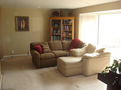
Here is a Living Room that we redesigned ---
Look at the BEFORE and AFTERS and tell me what made the difference.
I will give you the answers in my next post.
BEFORE
I do have to tell you --- I got started moving everything before I took the before photo, I am just so excited to get going and forget!! Originally there was a sectional where the piano is and then straight down the center of the photo toward you.
AFTER
AFTER
BEFORE
AFTER
Let me know what you think!
I am joining Met Monday---for some great before and afters go and take a look.
Labels: Living Room
2 Comments:
-
- Lindy said...
February 22, 2010 at 6:31 PMI like it! You have moved the bookcase to the center of the wall which helps make the room less one sided. I like the addition of some red items in the bookcase. Also the maroon rug on an angle ties the brown leather chair with the couch. Very nice!- Chris said...
February 23, 2010 at 11:17 AMyou made the sitting area it's own space. sofa and chair face each other.
Subscribe to:
Post Comments (Atom)


