What made the difference?
The bed was the dominant piece in the room. The wall to the right really needed something to balance out some of the visual weight of the bed.
AFTER
A dresser seemed like the logical choice. But thier bed has drawers underneath so they did not have a dresser.
In the closet we found a cedar chest. We also took a shelf with a quilt rod from another room, and together created enough visual weight to balance out the heavy bed.


Notice how all of these items seem to have a common theme. This homeowner is drawn to a country cottage feel. So when we shopped the house we were able find items that fit together nicely.
You will see this in your own home --- you are usually drawn to a certain kind of style or look.

 BEFORE
The bedroom was rather plain and showed very little personality.
 AFTER
AFTER
The additional pillows and quilt that were in storage really
helped to cozy up the bed.
The bed is the focal point of a bedroom and you want to make it look as inviting a possible.
Look how we tied the lavender, green and blue from the quilt throughout the room.
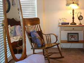
 This antique rocking chair and mirror from the basement really added some visual weight the the other side of the room. On the floor is a wicker basket with a few blankets folded up inside. Also the pillow in the chair continues to tie the color throughout.
 BEFORE
Notice the scale of the piece hanging above the bed.
It is too small for that space.
 AFTER
AFTER
The clock with the two wire candle holders feels better. It is the right size, and together they create more of a unit above the bed.
Also see how much cozier it feels to have the lamps ON.
As you look at the nightstands, you will see that we put together more of a unit, hanging something above the lamp. One side is more feminine and the other more masculine.
 BEFORE
 AFTER
AFTER
We balanced out this wall by adding the chair
and hanging the photos on the wall.
The plant adds a natural element and softens the space.


Notice how all of these items seem to have a common theme. This homeowner is drawn to a country cottage feel. So when we shopped the house we were able find items that fit together nicely.
You will see this in your own home --- you are usually drawn to a certain kind of style or look.

 BEFORE
The bedroom was rather plain and showed very little personality.
 AFTER
AFTERThe additional pillows and quilt that were in storage really
helped to cozy up the bed.
The bed is the focal point of a bedroom and you want to make it look as inviting a possible.
Look how we tied the lavender, green and blue from the quilt throughout the room.
 This antique rocking chair and mirror from the basement really added some visual weight the the other side of the room. On the floor is a wicker basket with a few blankets folded up inside. Also the pillow in the chair continues to tie the color throughout.
 BEFORE
Notice the scale of the piece hanging above the bed.
It is too small for that space.
 AFTER
AFTERThe clock with the two wire candle holders feels better. It is the right size, and together they create more of a unit above the bed.
Also see how much cozier it feels to have the lamps ON.
As you look at the nightstands, you will see that we put together more of a unit, hanging something above the lamp. One side is more feminine and the other more masculine.
 BEFORE
 AFTER
AFTERWe balanced out this wall by adding the chair
and hanging the photos on the wall.
The plant adds a natural element and softens the space.


Beautiful transformation. I love the addition of the bench.
ReplyDeleteSo Cozy and inviting. Thinking I could really do some sprucing up of my own room! This is just the inspiration I needed! Great ideas! Love it! =)
ReplyDeleteAs always, I love how you can "shop the house." Really like how you made one bedside table masculine and one feminine.
ReplyDeleteI love how you work with the homeowner's tastes and the things they have already. So many times it appears that the decorator has gone with their own taste, rather than the owner's.
ReplyDeleteJust wanted to let you know that the last several times I've visited your blog, the KSL Tv Segment on your left sidebar has been jutting out and covering part of your post. So I'm missing part of the photos and your comments :(
Thanks Holly, I will check into that, I have not had the same problem but will see if it continues to happen. Has anyone else had a similar problem with the KSL segment covering some of the post? Please let me know. Thanks so much to all of you and your wonderful comments. It makes doing this all the more fun!!
ReplyDelete-Angela