


Wednesday, July 20, 2011

Here is a quick little before and after.
Just want you to see how simple it can be to fill a space
when using the right design principles.

BEFORE
The space above this buffet is quite tall and
needs something in the right scale to make it feel complete.

AFTER
See how this is a simple solution.
The mirror is large enough to balance out
the piece of furniture and is the right size for
the space on the wall.
By hanging it vertically it is taller as well as narrow enough
to come in about 6 inches on each side of the buffet.

When you look at the whole grouping,
the height of the mirror, the lamp and the glass bowl
are three different heights.
the height of the mirror, the lamp and the glass bowl
are three different heights.
This is a simple way to create a unit that works!

Here is a little more of the room...
I will show you the rest soon.
Monday, July 18, 2011

This room makeover was done all by
the homeowner---herself!
She hired me to come and do a consultation,
we walked throughout the house and talked about
what she could do to make the family room more inviting.
After an hour and a half I left.
Some months later she called and said I am DONE!
Come and take the after shots.

Here is the entry BEFORE
The end table was just too short to fill the space.
AFTER
We found this dresser down in her storage room
(it was previously white).
This space needed something taller so that the scale would feel right.
See how a coat of paint, a little larger mirror and a lamp
magically changed this space.
Wow! the paint on the wall made such a difference,
the molding and the door really stand out now.
It also warms up everything---so much more inviting.

BEFORE
Notice the mirror propped above the fireplace,
it was really not reflecting anything interesting,
mostly just the ceiling.
This is the mirror that is now in the entry.
It adds light and movement to that space.
I really like mirrors in the entryway.

AFTER
She painted the wall a light beige and added the accent brown.
The homeowner also added new furniture which
really does update the family room.
Notice how we flanked the two sofas on either side of the fireplace.
This helps to create a nice focal point,
and a great conversation area.

BEFORE
Here she had a number of smaller items on the mantle
as well as hanging on the wall.

AFTER
Look at how much better it feels to take a collection of items
and place them together in a group---the box shelves on the left
and the three framed photos on the right.

The fabric on the chair is repeated
with a couple of toss pillows on the couch.

See the touches of red throughout the room.
It gives a pop of life to the space.

Nice simple focal point.

It is always important to have items in the room that you love.
The painting was important to her,
as well as the quilted wall hanging that her mother made
specifically for the new colors in the room.
This makes the room yours.
Okay, I want to sit by the fire and read a book here!
So... see what a great transformation was made.
This homeowner just needed a little direction,
She knew what she liked but was
not quite sure how to get it.
I came in and gave her a few ideas and
suggestions, but she did all the work!
I am so happy to help any of you . . .
This also makes a great gift.
My consulting rate is $50.00 an hour.
Monday, July 4, 2011

I wanted to post a few more observations that I had
while touring through the Utah Valley Parade of Homes.
So many of the rooms in different homes had
white trimwork up the walls.
I really like it!
I think it gives the space a fresh and clean updated feel.
I really like this headboard
and the pillows with a touch of blue and green.

Here is more white finishwork on
the walls of this bedroom.

I like the white trim in the ceiling, with the tan color paint.
It looks so great with the stone!

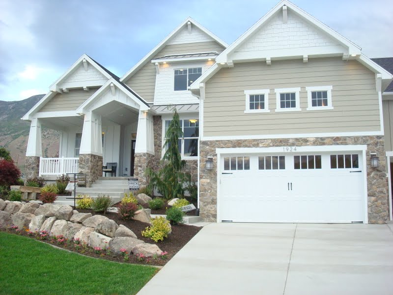
I love this style of house!

Look at the white trim going up the stairs ...
and the railing finish work.
Very refreshing!
I love the white with the chocolate brown rail.

Notice how the cabinet and the artwork
make a very nice grouping.
Also love the lamp lighting.

In this laundry room notice how the fabric
in the curtain ties in with the pillows on the chair.
Isn't this such a lovely space.
The peach color on the wall would not have
been my first choice, but look how great it all ties together.
The chandelair finishes off the room perfectly.
Still love this style.

Here is the inside of the previous house.
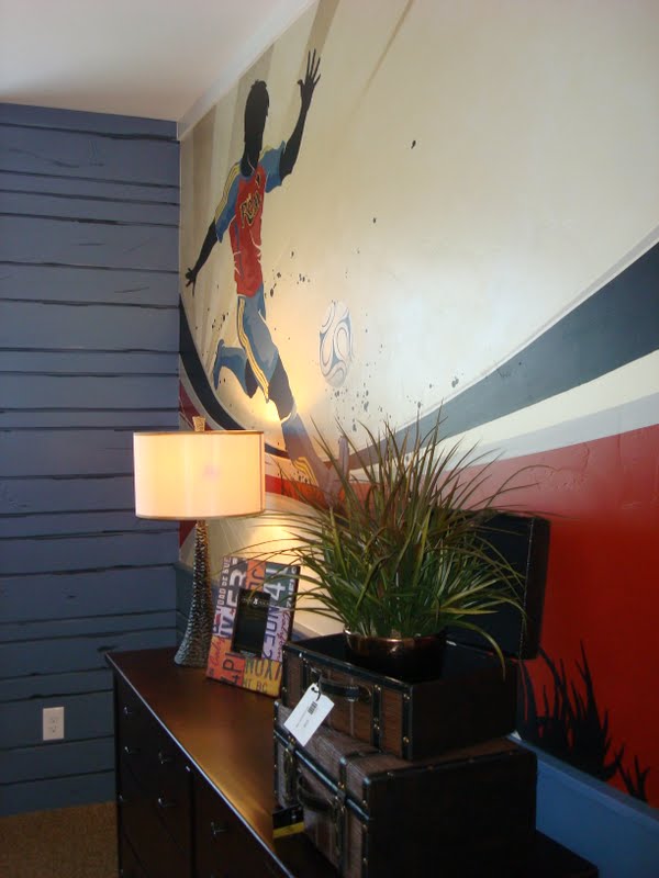
This boy's room was fun.
Notice the wood finish on the blue wall.
It makes for a nice texture,
and of course the mural is great!

Now this is a unique boy's room.
My son who is 11 loved the room
except for the metal on the wall.
The wood on the ceiling, the quilts and the
red accessories cozy up the space.
It is always fun to see the new trends and get some inspiration.
Even if we only take a small idea here or there.
Hope you are all having a great 4th of July!!
Thursday, June 30, 2011

I went to the Utah County Parade of Homes and BLUE
was in this year!
I have never really been a fan of blue,
but I have to say it is growing on me!
Just thought I would show you a few photos of
the blue decor.


What do you think?
Do you want to add a little blue paint
or maybe a few blue accessories?
I don't know, I may just add a few myself . . .
I will let you know.
Here are some more ideas for BLUE at:
HGTV.
Thursday, June 9, 2011

This room started out completely different---
but by shopping around the house and using items that the homeowner
had in her home already, we created a
completely different space!

BEFORE

AFTER
The antique secretary and the couch were in the basement.
The rocking chair was in the bedroom.
The other chair was in the family room.
And the two end tables were elsewhere in the house.

BEFORE
The floral sofa and loveseat were dated and she just wanted an excuse
to part with them---and this was it!
The grouping above the couch was a little too high
so it felt disconnected from the loveseat.

AFTER
See what a nice grouping we made with the leather sofa
the artwork and the lamp.

BEFORE
We took most of these items out of the room,
and created a really different feel.

AFTER
We traded the curtains from the family room to create a more formal feel.
The table is more to scale with the two chairs in this after shot.

BEFORE

AFTER
The lamps and the artwork are about the only items
that were in the room originally.
This homeowner had a number of furniture pieces that had
belonged to her grandmother.
They were in different places around the house.
But once we pulled many of them together in one space
it created a completely different style.

Notice the curtains.
I really like them better than the topper that was originally there.
The colors work very nicely in this room.

BEFORE

AFTER

Now with the curtains changed out.
Which one do you like better?

The small pieces of artwork are needlework and buttons,
They go so well with the antique feel in this room.
It is so interesting how we collect different items that we love
and usually you can see a theme that runs through them.
So when you place these items together using
design principles it feels really nice!

BEFORE
See how there were a few too many items in one space.

AFTER
If you take out some pieces and free up a little room
it looks and feels much more inviting.

See how fun this can be---
Look around your house and see if you can do a room makeover!
Subscribe to:
Posts (Atom)