


Monday, April 26, 2010

Add a chair or two and you will be amazed at how much personality it creates.
This chair was found in the classifieds and was a perfect fit for the room.

Notice how these two chairs do not match but they look great with the other decor.
Do not feel like your chairs have to match --- this way you can add a thrift store chair with your expensive designer sofa, or your grandmas rocker with a favorite overstuffed chair.
The Key is to have similar colors or patterns that are going on throughout the space.

These bold blue chairs really add some personality to this room!

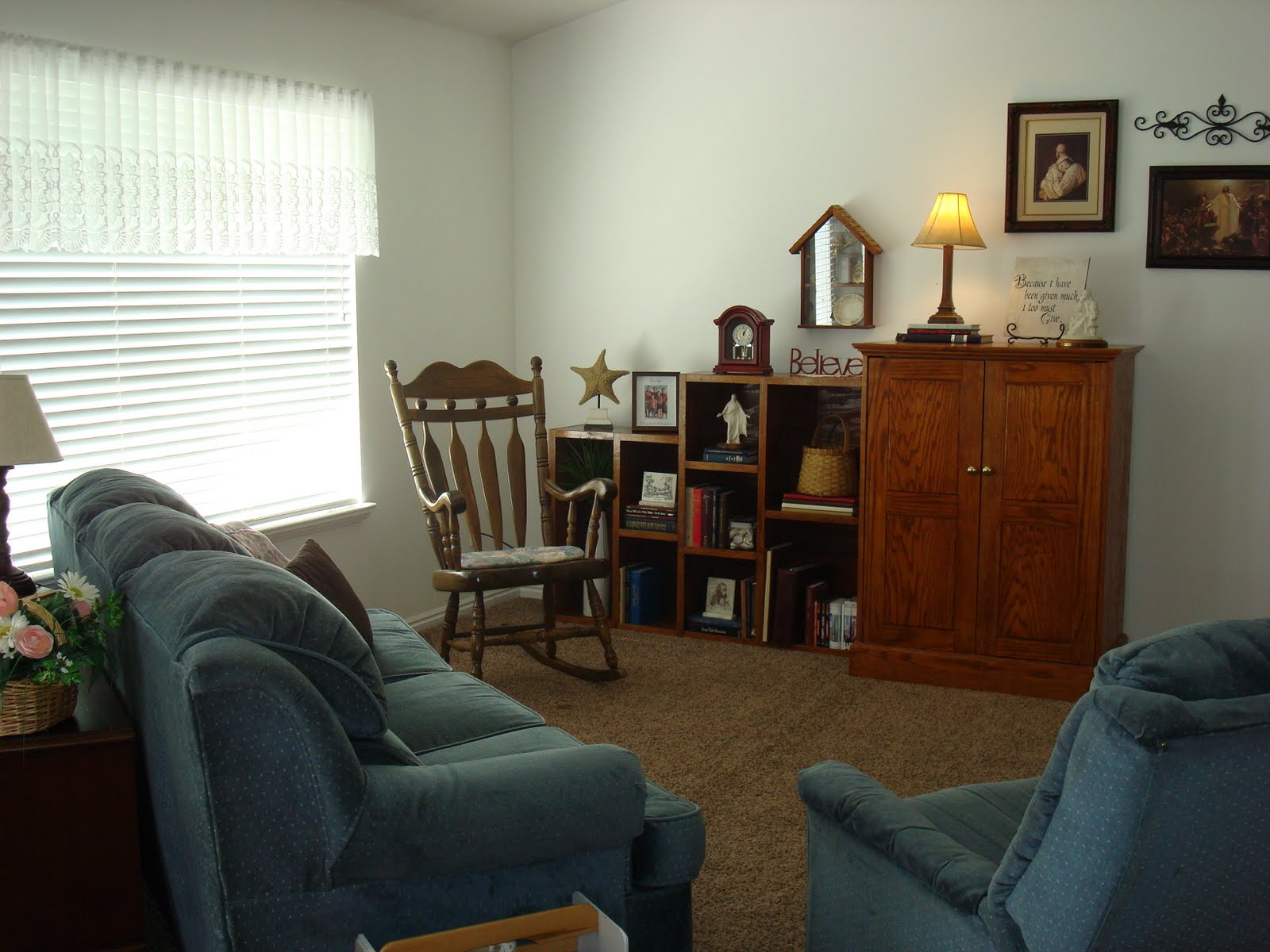
Here are a couple of dining chairs that work great in the entry.

Chairs can be expensive but these two I found in the classifieds --- the leather chair was $170.00 and the chair and ottoman $100.00. So keep your eyes open for these kind of deals and you can make your room much more versitile!

These two chairs match ... and don't they make a statement.

This room has a number of chairs and it creates a very different feeling than if you were to use a sofa and a love seat.
See how the ottomans do not match the color of the chair but it looks good.
Look at chairs a little differently and see what you might change up at your house!
I am joining the blog party at Between Naps on the Porch
go and take a look
Monday, April 19, 2010
Here is the Studio 5 segment that we did today.
(I have to say they are so fun to work with!)
1- A Collection. This really is a great place to showcase a collection. Use items that have a particular theme or color; maybe you love blue glass and have all kinds of shapes and sizes. Dishes out of your cupboards can make a very nice collection. I found some great pictures of a collection of cake plates and other assorted treasures that Julie from http://www.thelittleredshop.blogspot.com/2010/04/ma-cuisine-week-iii-little-missed.html arranged above her kitchen cabinets.
(Thank you so much Julie!)
(Thank you so much Julie!)


2- Natural Elements. I love to add some unexpected greenery; boxes of grass, a few balls that are covered in berries or some fruit.
3- Groupings & Different Heights. You can use this design principle in all kinds of accessorizing and it will work. Group items in odd numbers, using different heights, then play with it. Do not be discouraged if it does not come together the 1st time. Keep trying and you will come up with something that you like. You also get a lot of exercise climbing up and down from your counter!
4- Using the Right Size Items For Your Space. If you have a taller ceiling and more space, you want to use items that are larger in scale so that it feels balanced. If you put smaller items in a large space it will just feel cluttered. If you have a smaller area and you try to fit in items that are too large it will feel off balance. So if you are aware of this when you start it will help you in deciding what works for that area and what does not.

Today I am going to give you the answers to the Redesign quiz that we had on this lovely Living Room!

BEFORE

AFTER
The first thing we did was create a more balanced feel to the room by moving the furniture so that weight was evenly distributed throughout the space.
So... BALANCE to the room.

BEFORE

AFTER
See how we were able to take a few things away and it feels more evenly weighted.

We added tables. TABLES allow you a space to accessorize.

We created more of a FOCAL POINT. A fireplace is a natural focal point in a room. If you can emphasize it more with a few interesting accessories it is a place that your eye is drawn to. The little gold couch is a very special piece and quite unique. The mirror that we placed above the fireplace is the right scale for the wall and it creates more light and movement to the room.

LIGHTING.
We turned on the lamp! See how it really warmed up the space. It creates a warm and inviting feel to the room.

We brought in a few NATURAL ELEMENTS. The Green plant and ...

The BASKET of PINECONES. Also notice the wicker baskets under the couch in the previous photo and the basket with the pinecones. This adds a nice TEXTURE to the room.

We brought in this little cabinet. It was a perfect piece to use for accessories and add some personality and the color works great.

See how we chose just a FEW items to place on the inside. This makes it more pleasing to look at and highlights what is there.
In this BEFORE photo you can see that the little cabinet was at the end of the hall.

It is always fun to add a little wimsy to your room. This little frog prince reading on a stack of books was just FUN!

BEFORE

AFTER
YOU can really feel the difference! And this was done using just what she had in her home already.
You can really see her style can't you.
We all have a certain style --- if you look around your home you will see there are some things in common.
Whether it is colors or shapes, you will notice when you shop you are drawn to certain kinds of items.
So as you follow these simple little design tips that I shared with you today you will be able to transform a space in your own home --- HOW FUN!
I am joining Susan today at Between Naps on the Porch for some fun BEFORE and AFTERS.
Sunday, April 11, 2010

Take a look at the before and after shots of this Living Room.
This is a perfect time to quiz yourself and see if what I have been teaching you is working!
Make a comment and share what you see that made the difference.
(I will give you all of the answers in my next post.)

BEFORE

AFTER

BEFORE

AFTER

BEFORE

AFTER


This homeowner had the most interesting items!
See if you can imagine some of your own "Interesting Items" placed using a few of these principles.
I am joining Metamorphosis Monday over at Between Naps on the Porch.
There are all kinds of before and afters!
Tuesday, April 6, 2010

Today, I want to show you how to create a conversation area.
This Living Room above, was so fun to do. The homeowner had the most interesting items, I am going to show you more of this room later in the week.
But for now we will be focusing on what makes a conversation area.

BEFORE
See how the sofa is alone, and if you were to have a visitor
it is more difficult to visit.

AFTER
We brought the two sofas across from each other. The area rug is a nice anchor--- it visually pulls the two couches together and you feel as if you want to sit down and have a conversation.

BEFORE
These two sofas were near each other but there is a walkway
right between them.

AFTER
It is more ideal to pull the two closer together and have
the walkway behind the loveseat.
Adding the end table between the two helps to make it feel
more like a unit.

BEFORE
The couch is lonely and it does not feel like a place you would want to sit down and have a conversation.

AFTER
With the couch and the loveseat in an L shape with the table,
it feels more inviting.
See how this is working . . .

BEFORE
AFTER
We positioned the furniture in a U pattern and it made it easier
to face each other and visit.

BEFORE

AFTER
By adding the rug and pulling the furniture closer together we created a more inviting space.

BEFORE
This chair seems very far away from the rest of the room.

AFTER
By balancing the room with more weight on the large wall, we were able to move the chair up. We also arranged the area rug so that it touched the chair and the sofas. This pulled the seating area together and made for a more inviting and comfortable space.
See how by just moving things around and using a few simple design principles you can create a more Cozy and Comfortable space!

Stay tuned for more photos of this
Living Room Redesign
in my next post.
Happy Re-Arranging!!
Subscribe to:
Posts (Atom)